The Inspiration Elevator app is an app we started developing in Q4 of 2021 and which we finalized the first major milestone of in Q2 of 2022. It’s still an ongoing project that we love and there are many more features to come.
It’s also our first project to work on since we started providing businesses with software services.
In this case study, you’ll find out more about the “behind-the-scenes” processes of Softaware by bringing over the founder of Inspiration Elevator for an interview. Later on, we’ll describe how we built the app from our point of view and how did we manage to build an efficient, future-proof, and cross-platform mobile application for iOS and Android. Stay tuned!
The Problem
The Inspiration Elevator project combines the efforts of 4 partners, representing three main regions of Europe – Nordic (Norway), Central (Austria) and South Eastern (Bulgaria and Croatia). The starting point of our joint effort is supporting youth workers in introducing, organizing and implementing design thinking processes in their daily interventions with youth in risk, which will enhance youth employability and employment prospects.
In most cases, employment support interventions targeting youth at risk have temporary effect. Young persons experience training and support activities to enhance their employability, which in the best-case scenario result in their short-term employment. Following this employment period, they are forced to seek again support from above mentioned services hoping to get sustainable realization in both personal and professional life. Despite the positive effects from national measures, the reality of young persons in risk staying long out of job and education calls for reconsideration of the philosophy and methodology of existing youth work services.
The Challenge
The founders wanted us to develop a cross-platform (for iOS and Android) mobile app for trainers of youngsters to help them learn and practice Design Thinking skills. The specific of the app is that they wanted to make the trainers feel they communicate with a real Coach. At the same time, they did not want to use artificial intelligence because of the time necessary to develop and the overall cost related to it.
Also, their research showed that often AI can make mistakes that could put off their trainers as they are a pretty specific target group. The founders needed another solution – a tree-like logic conversation, where the choices of the user will bring them to a different scenario.
Before Solving The Problem
A short interview with Inspiration Elevator’s founder, Iana.
How did you select Softaware and what were the deciding factors? 🤷♀️
We needed some out-of-the-box thinking developers. We met a few companies that were trying to tell us what we wanted could not be done or it was difficult, it would not be good for the final user, etc, etc.
But we were looking for possibilities, not for restrictions. Immediately there was a click with the guys from Softaware.
Young and passionate about their work – similarly to us – they were curious to find a way to develop what we want. Working with opportunities rather than limitations was the biggest advantage they had in addition to being a small and flexible company. We love direct communication, proactivity, and co-creation. Something that we brilliantly do together with Softaware.
Describe the scope of work in detail, including the project steps, key deliverables, and technologies used.
- Frame-setting meetings – where we were setting the scope of the project app, the main functionalities, and features, and expectations on what and how will they do;
- Development of wireframe of most screens and their functionalities;
- Project plan development with milestones and deadlines;
- Agreeing on the main expectations about design, colors, shapes, and arrangement of elements;
- 3 Figma designs of the mains screens;
- Database development, arranging what info and how we will keep it;
- In the meanwhile basic structure of the app’s framework has started and we were reviewing each ready feature. Very lean and clean.
- Together we were developing the logic of the most important part of the app – the “chat”.
- Testing different possibilities, with embedded pictures, video, pauses, avatars, and other options.
- Implementation and testing, implementation and testing, implementation and testing 🙂
How many resources from Softaware’s team worked with you, and what were their positions?
Not to mention that because of the deadlines of the project and some late changes we implemented in the logic of the conversation of the app, all of the guys are working on Easter holidays to help us not fail what we promised to deliver.
Results & Feedback
Asking the project’s founder on what we can improve.
Can you share any measurable outcomes of the project or general feedback about the deliverables?
Pretty straightforward – when you co-create the results are as you want them to be.
So far we have achieved what we have hoped for and even more 🙂
Describe Softaware’s project management style, including communication tools and timeliness.
We use Discord as a communication platform and what we love about Softaware is that the whole team was involved in the project. Not only as being present but being active. As a client, we may be pretty bearable BUT we do have our specifics and expectations. We may be having questions or needing help in the late evening or during the weekends and we have always had somebody from the team is there for us on Discord, giving us a helping hand.
What did you find most impressive or unique about Softaware?
As described before – flexibility, ease, and transparent communication style, co-creation, and engagement, solution-oriented, open-minded and curious.
Softaware feels like an extension of us, rather than a third-party vendor.
Are there any areas for improvement or something they could have done differently?
There is always something you can do better. But we are all on a life-long-learning journey so we love and focus on all the added value, benefits, and know-how we gained.
Before going to the next chapter, we’d like to thank Iana for the trust and the opportunity and praise her for being a person who makes us and everyone happy.
It is a pleasure working with you!
Ready, Set, Action ⚡
How we developed Uzunov Consulting’s website and which technologies did we use
Planning ✏️
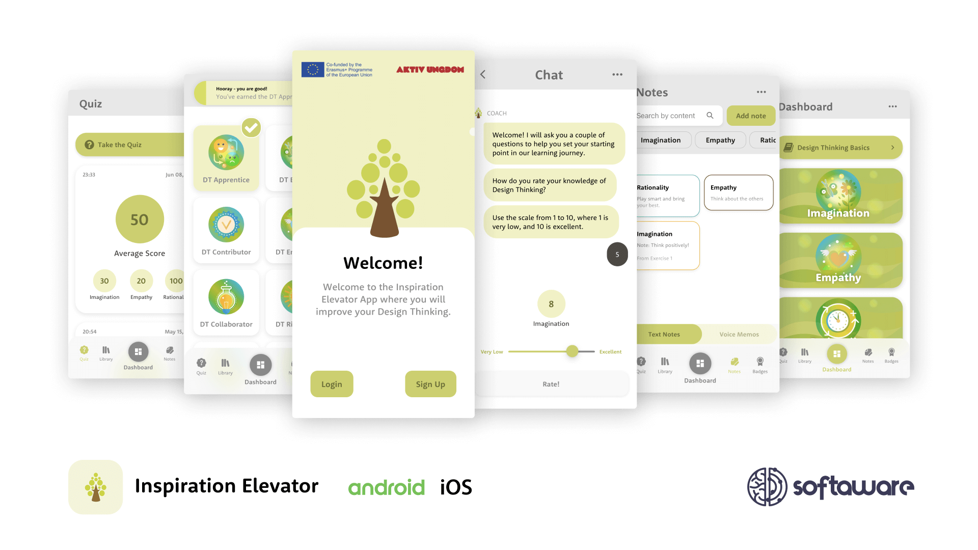
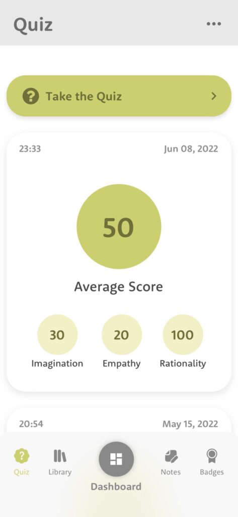
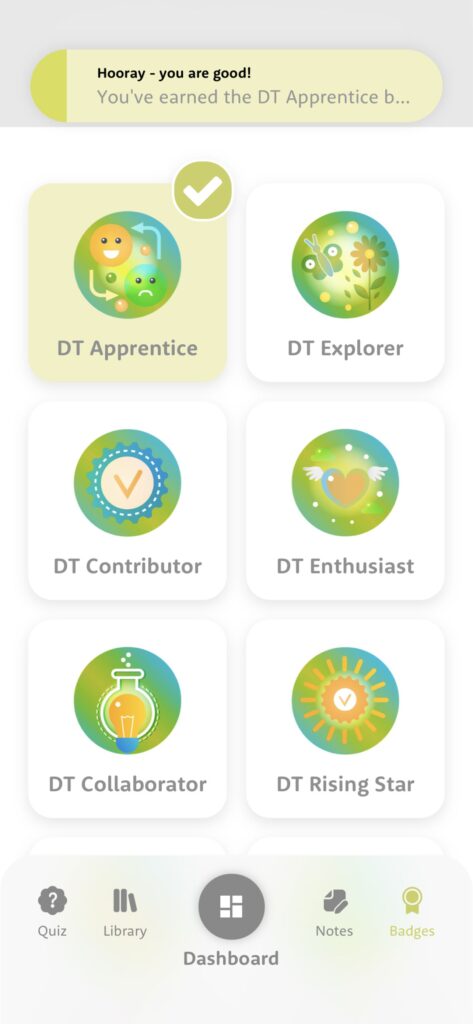
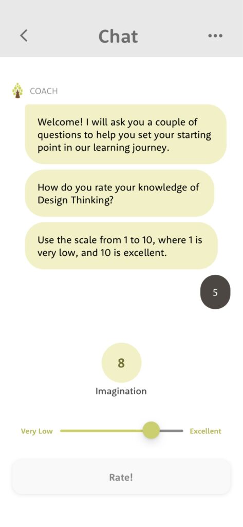
We had to plan the application in such a way that it would require an optimal amount of effort from us to meet the deadline. The length of the first milestone was several months, and we had the task of making a cross-platform, feature-rich app for iOS and Android. The Inspiration Elevator app included an Onboarding screen, an easy-to-use Dashboard, a screen for taking notes and voice memos, an achievement system with badges, and most of all, a chat that had its own features – acting as a real coach, presenting videos, prompting the user to write notes and following specific logic depending on the user’s response.
We did the planning by dividing the project into internal milestones. Then, we broke the project into even smaller tasks. We used a principle where we break something huge into very small, easily consumable chunks. In the meantime, we asked the app’s founders what are the most important screens without which they can’t present it to their partners. This gave us the ability to prioritize.
Onboarding New Users 👋
We knew that the age group that would use the app was not fixed. This meant that we had the task of making the screens easily accessible and minimal so that people who were not tech-savvy could also use the app effortlessly. This proved to be an advantage because it helped us clean up the design concept, and there weren’t that many components to develop.
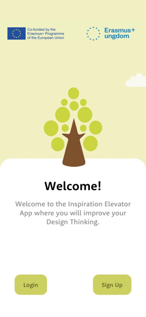
The Onboarding screen was supposed to open the door to the app and hold users’ attention. So we had to add something interactive – an animation to pique the users’ interest in what awaits them inside.
With any first screen of an app, it’s crucial to keep the actions to the desired outcome to a minimum. In this case, the outcome that was targeted was for users to make their accounts quick and easy. For us, that meant 2 buttons and nothing more – for login and registration. If we could, we would have reduced this even more, but we sacrificed that for the sake of animation. We think it was worth it.
The Dashboard 📋
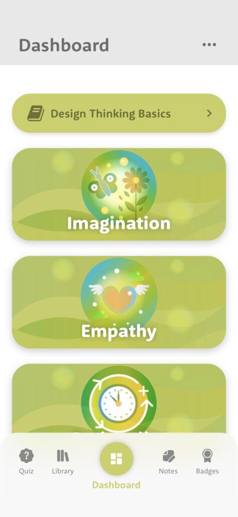
The Dashboard was supposed to represent the gathering place from which the user’s choices begin. From there they should be able to choose between being trained in Imagination, Empathy, or Rationality. We had to fit all the categories of training, along with their companion images, on one screen. That doesn’t sound challenging enough, but let’s also mention that all 3 had to be visible at the same time, regardless of the screen height.
Sounds a bit more complicated now doesn’t it? Header, long content, and footer. No scrolling.
We managed to turn the problem into a feature. We made collapsible buttons for the categories with interesting animation. When clicked, the description of a category is displayed, along with a button that opens a chat with the virtual coach. We’ll talk more about it below.
The Notes & Voice Memos 🎙️
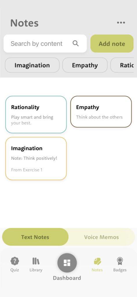
The user had to be able to log their experience with the app, complete tasks from the chat exercises, and/or record progress with the Notes screen. We also had as an assignment to make so-called Voice Memos – the possibility for the user to record notes with his voice.
First, we had to divide the notes into the categories that the exercises are divided into. We also divided the screen into 2 tabs – one for the text memos and one for the voice memos.
Naturally, not everything went smoothly.
It turned out that one of the testers’ feedback was that they didn’t know which memo referred to which exercise. So we had to add a slider with the last chat messages before an exercise was executed. We put it under the title field for the note.
The Chat 💬
The Chat screen was the most complicated thing to implement. We had the message structure and sequence for each exercise in tabular form. The data was far from ready for direct use because it wasn’t done by tech people.
We had to figure out a way to integrate the tree logic of each exercise. We went looking for pre-made solutions and found some pretty cool libraries for implementing a chat. The problem was that they were radically different from our goals.
After some headache sessions, we figured it out.
We developed our own React hooks that manage a system of chat messages. The UI just started using the return value of the hook, without caring what happens inside. This significantly improved the app’s feature encapsulation.
We turned the exercises into separate JSON files with their own logic, custom payloads of information, and triggers that trigger events in the app (saving a note, moving forward, watching a video, etc.).
The first version of the code looked terrible, but after a few successive refactoring sessions, we made a work of art. 🤓
The Technologies 👨💻
As mentioned above, we needed to make a cross-platform solution for the optimal amount of time we had. For this reason, we decided on React Native, and more precisely Expo, for the development of the application. That allowed us to develop the app for two different platforms (iOS and Android) with the same codebase, which saved us a lot of time.

Expo has a variety of pre-developed APIs that directly communicate with different parts of the operating system, be it iOS or Android. Something Expo provides that many other frameworks don’t is the Expo Go app, where by scanning a QR code you can effortlessly test the project you’re developing without any downloading or uploading to the app stores. As you can imagine, the app founders loved that feature, as they could test different versions of the app, at any time, through Expo Go without downloading a bunch of stuff every time, wondering which is the latest build.
Like most apps and websites, ours also needed a database, backend, and storage. In the beginning, we decided to use Strapi – a CMS based on Node.js, with which we could easily manage and store the data of our application. Almost immediately after starting the development of the app, we realized that our backend needs were different, especially when we got the requirement for users to be able to log in and register in the app with 3rd-party providers. We ditched Strapi and then, after reviewing the requirements again, settled on Firebase.

Firebase is a set of Google services focused on developing applications and websites without the necessity of a separate backend. They include a database that supports real-time CRUD operations, storage, easy integration with 3rd-party providers, a mailing server, various add-ons, and more. The entire platform is based on Google Cloud, which allowed us to be more flexible in some cases where the simplified Firebase panel did not work for us.
Did we make the right decision to switch to Firebase? Absolutely!
We managed to implement the 3rd-party integrations for signing up and signing-in in no time. The real-time communication database, Firestore, has done an excellent job for us as we use it not only for storing data but for better user experience and caching in several places through the application. Also, the database is NoSQL-based, which allows us to edit the data through the Firebase GUI much more effortlessly than a traditional relational database. And, of course, we store the various user resources in Google Storage.
To style the application, we used React Native’s built-in stylesheet language, which is almost 1:1 with the popular CSS-in-JS libraries for the web.
For the animated assets, we used lotties because they are optimized, provide smooth 60-fps transitions, and are small in size.
The end?
Of course not. As we’ll be sharing case studies for the projects we develop, we’ll also share updates on each one of them. There’s more to come for the Inspiration Elevator app and we’re looking forward to developing fresh new features.
If you liked that case study or if we made a good impression on you by any chance, consider hiring us for your next project. We’re prepared 🤙